
SBA 7(a) Default Rates Hit 4.8%: What the Credit Data Says About Small Business Risk
Brett Caines
The SBA 7(a) portfolio's twelve-month default rate reached 4.8% in March 2026, the highest since 2013. Bank earnings and Fed delinquency data show no such stress. Both readings are correct, and the gap between them is the story.
Key takeaways
The trailing twelve-month default rate on the full 7(a) portfolio hit 4.8% in March 2026, the highest since 2013. It got there without a recession, which is what makes it worth reading closely.
The 2021 floor was never a credit outcome. PPP, EIDL, and Section 1112 debt relief suppressed defaults directly, so every comparison to that trough flatters the present. Measured against the pre-pandemic era, the program is now roughly three tenths of a point below its dotcom-bust peak.
The aggregate credit data is structurally blind to this. The 7(a) credit elsewhere test means the program is composed, by statute, of borrowers the conventional market does not serve, so bank C&I delinquency describes a different population. Indicators aimed at small firms specifically, including Subchapter V filings, the Fed's small business survey, and the SLOOS question that isolates small firms, all corroborate the SBA signal.
The risk is concentrated, and its shape has changed. Recent vintages default roughly twice as fast as pre-2020 cohorts at the same loan age, and the size-risk curve is now U-shaped: the smallest loans are still worst, but the largest have gone from safest in the book to third-riskiest.
The small-loan retreat looks more like economics than credit. The band that fell hardest in FY2026 was not the riskiest band. It was the one that lost its exemption from full cash flow underwriting.
Lender outcomes span 11.8 points. Across 36 lenders with $1B+ 7(a) portfolios, 2025 default rates ran from 0.5% to 12.3%, close to four times the distance the program average moved across the entire cycle. Eleven of the 36 are running below their own 2019 rate.
Every safety net the 7(a) program leaned on between 2020 and 2022 is gone, and the portfolio is finally reporting on its own merits. As of March 31, 2026, the trailing twelve-month default rate reached 4.8%. That is the highest level since 2013 and roughly three times the 2021 low.
The instinct is to call this a credit cycle turning. That read is too fast. Pull in the sources a credit committee would normally trust to confirm a downturn, and most of them disagree. The interesting question is not whether 4.8% is high. It is why almost nothing else in the standard data stack is flashing, and what that tells you about where small business risk actually lives.
All 7(a) figures in this analysis are drawn from loan-level data in the Lumos Data Portal.
THE LONG ARC · 1996 TO 2026
The floor was never real
Start with three decades of context, because the 2021 number distorts everything measured against it.
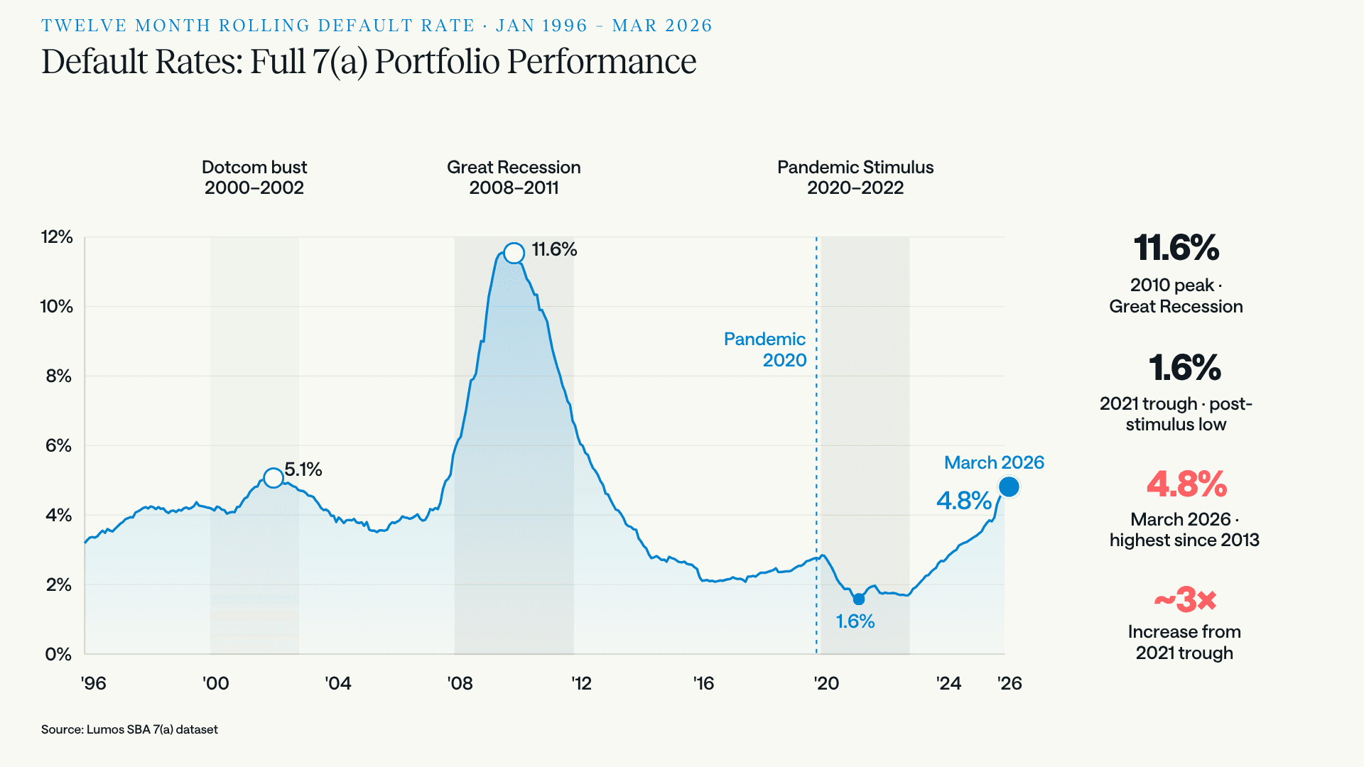
Twelve-month rolling default rate, 1996 to 2026. The 2021 trough of 1.6% is the anomaly, not the current 4.8%. The 2010 peak of 11.6% remains more than double today's rate.
During the pandemic, federal intervention did not reduce business failure so much as postpone and paper over it. PPP and EIDL flooded borrowers with liquidity, and Section 1112 relief had the SBA paying principal and interest on 7(a) notes directly. A loan cannot default while the government is making its payments. Defaults fell to 1.6% in 2021 because the mechanism that produces defaults was switched off.
That makes any "up 3x from the trough" framing technically true and analytically useless. The more honest comparison is to the pre-pandemic era, where the portfolio ran between roughly 2% and 4% in normal conditions and touched 5.1% in the dotcom bust.
Against that baseline, 4.8% is elevated, and the comparison that matters is not 2010. The 11.6% peak of the Great Recession was the worst credit event since the Depression. Measuring against it makes almost anything look benign, which is exactly why it is the wrong yardstick. The useful marker is 5.1%, the dotcom-bust peak. The program is roughly three tenths of a point below, which puts today's 7(a) portfolio at roughly the second-worst default level in thirty years.
What should make that uncomfortable is how it arrived. In 2002 and again in 2010, defaults rose because the economy contracted. Neither is true now. Reaching dotcom-bust default levels during a recession is a cyclical event. Reaching them without one is a different kind of signal, and the rest of this analysis is largely an attempt to work out what kind.
THE CROSS-CHECK · IS THIS JUST SBA?
Everything else says small business credit is fine
Before attributing 4.8% to a deteriorating economy, it is worth asking whether anyone else sees it.
Mostly, they don't. The Federal Reserve's charge-off and delinquency series put business loan delinquency at all commercial banks at 1.3% in Q1 2026, contained and below where it sat through much of the 2010s. Banks outside the 100 largest, which skew more toward small business lending, ran 1.8% on the same seasonally adjusted basis, down from 1.9% in Q1 2025. In second quarter 2026 earnings, JPMorgan reported credit costs of $2.5 billion and lowered its full-year card net charge-off guidance to about 3.2%, citing better-than-expected consumer performance. Wells Fargo's commercial net charge-off rate fell to 0.1% annualized from 0.2% the prior quarter.
Nothing in those releases tells a chief credit officer to worry.
Now change the aperture to instruments that only capture small firms, and the picture inverts:
Small business bankruptcy is accelerating. Subchapter V elections within Chapter 11, the restructuring path reserved for small businesses, totaled 1,663 in the first half of 2026, a 50% increase over the 1,107 filed in the same period of 2025. Epiq AACER attributed the rise to higher borrowing costs and softening demand. One qualification and one reinforcement. The eligibility ceiling adjusted from $3,024,725 to $3,424,000 on April 1, 2025, so H1 2025 spans both figures while H1 2026 sits entirely at the higher one; the affected band is thin. Set against that, the ceiling contracted sharply in mid-2024 when the temporary $7.5 million cap lapsed, which removed filers between roughly $3.4 million and $7.5 million from eligibility altogether. Counts should have fallen on that change alone. They rose by half.
Small firms report thinning margins. In the Fed's 2026 Report on Employer Firms, expectations for revenue and employment growth fell to their lowest levels since 2020. For the second consecutive survey, more firms reported revenue declines than increases. Rising costs was the single most common financial challenge, and more than four in ten firms cited tariff-related costs specifically. Meanwhile 38% still carry more than $100,000 in debt.
Banks themselves expect it, but only here. The January 2026 SLOOS asked banks what they expected across 2026. They expected loan quality to hold around current levels for C&I loans to large and middle-market firms, and to deteriorate for C&I loans to small firms. It is the one forward-looking indicator in the mainstream stack that isolates the same segment the 7(a) data covers, and it points the same direction.
Both readings are accurate. They describe different borrowers, and not by accident.
The 7(a) program has a credit elsewhere test written into it. A borrower is eligible only if they cannot obtain credit on reasonable terms and conditions without the guaranty. That is the premise of the whole program: it exists to fill a gap the conventional market will not. Which means the 7(a) portfolio is, by statute, composed of borrowers the conventional market does not serve.
That does not make them bad credits, and the distinction matters. The gap is usually about collateral coverage, operating history, or the term the borrower needs rather than character or capacity. Plenty of sound businesses cannot get a ten-year unsecured note from a bank at any price. But it does mean the population is structurally thinner than a conventional book: less capitalization, personal guarantees, heavy variable-rate exposure, and no cushion for a bad two quarters. A bank's C&I book is anchored by exactly the companies a conventional lender will serve on its own terms.
So 7(a) default rates should run above bank C&I delinquency. They always have, and comparing the two levels tells you nothing. What is worth comparing is where each population sits against its own history, and that means applying the same correction to both. The pandemic floor was artificial in the bank data too. Non-top-100 delinquency bottomed at 0.9% in the first quarter of 2021, the lowest reading in the thirty-nine years the series has existed, and has since risen by more than 90%. Flat describes the last four quarters, not the arc.
What separates the two populations is where each stopped. Small-bank delinquency normalized back toward its historical range and halted well inside it, below where it stood in the first quarter of 2020, before any of this began, and at 47% of its 2009 peak. The 7(a) portfolio normalized past its own range. Two populations recovering from the same suppressed floor, and only one of them kept going.
Which is the argument for watching this book even if you never make a 7(a) loan. Adverse selection by statute makes the program a magnified read on the marginal small business borrower. When conditions tighten, the businesses already sitting at the edge of bankability move first; the ones with room absorb it quietly for a while longer. Aggregate bank credit metrics pick that up later, if at all.
That is the practical takeaway for anyone benchmarking a small business book against industry credit data. The index you are comparing yourself to may not be representative of your borrowers.
HOW TO READ THIS · METHODOLOGY
Why every rate here is conditional
Every default rate that follows is conditional, also called survival-based. The denominator considers the loans still active at the start of each year, not the loans originally booked. As loans amortize, pay off, or default, the pool shrinks, and the rate measures the risk of what is actually still there. It answers a specific question: of the FY2023 loans still on the books today, what share will default this year?
The alternative, dividing by the original cohort, is the unconditional or cumulative view. It answers a different question: how much will this pool lose across its life? That is what pricing a new loan needs, and it is the quantity CECL reserving ultimately has to report.
The two are not really rivals, and it is worth being precise about why. A lifetime loss estimate is usually built from conditional rates rather than instead of them. You estimate a period-by-period conditional probability of default, weight each period by the probability the loan survived long enough to reach it, and chain the result into a cumulative number. The conditional curve is the input. The cumulative loss is the output. So the question is rarely which measure is correct. It is which end of that pipeline the task lives at.
Reporting a reserve lives at the output end. Working out what is happening to a book right now lives at the input end, which is where this analysis sits and why every rate here is conditional. Putting the conditional, survival-based view to work on these questions succeeds for two specific reasons.
First, it makes cohorts of different ages comparable. The FY2024 cohort has had almost no opportunity to leave the portfolio. FY2016 has had a decade of it. Asking what share of each cohort's survivors failed in a given year puts them on the same footing regardless of how long they have been on the books. Put both over original denominators (unconditional) and much of what you are measuring is elapsed time, not credit.
Second, and this matters more in 7(a) than in most asset classes, it captures what attrition does to a pool. Loans exit this portfolio early and often. Businesses sell, borrowers refinance into conventional debt, notes retire ahead of maturity. The loans that leave voluntarily are disproportionately the good ones, because a strong borrower has options and a struggling one does not. So the pool that remains is riskier than the pool you started with, and it gets more so every year that passes. That is not a market condition; it is arithmetic. A conditional rate shows it to you. An unconditional rate averages it away.
Here is what that looks like on a single cohort.
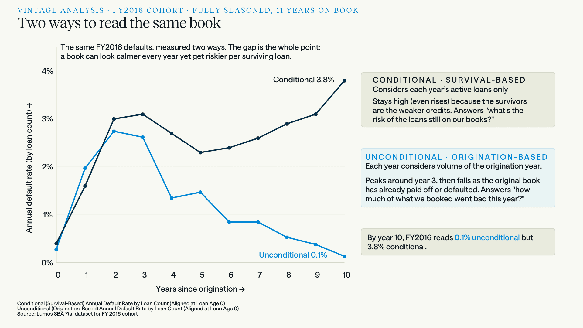
The FY2016 cohort, fully seasoned, measured two ways. Same loans, same defaults. The unconditional line peaks around year 2 and decays toward zero as the original book pays off or fails. The conditional line dips, then climbs to 3.8%, because what remains is progressively the weaker half of the cohort. By year 10 the same book reads 0.1% one way and 3.8% the other.
That is a 38x gap between two defensible readings of one portfolio, and neither number is wrong. They answer different questions. The unconditional line says how much of what was booked in FY2016 went bad in a given year, and it falls because there is less and less of the original book left to go bad. The conditional line says how risky the remaining FY2016 loans are right now, and it rises because the borrowers who had somewhere else to go have already gone.
A lender watching only the first line would conclude the FY2016 vintage got safer every year after 2019. The loans still on the books say the opposite.
The practical version: two lenders can post identical unconditional default rates while carrying completely different risk, if one's healthy borrowers refinance out and the other's stay put. Conditional rates make the difference visible. It is the same logic the secondary market already applies to 7(a) pools, where conditional default rate sits alongside conditional prepayment rate for exactly this reason. We take up that second exit in a companion analysis of SBA 7(a) prepayment speeds and the competing-risks view, where falling prepayment turns out to confirm that the default rise is real credit deterioration rather than a survivorship artifact.
VINTAGE · AGE-ALIGNED PERFORMANCE
The problem is concentrated in what you booked recently
Portfolio-level snapshots blend seasoned loans with new ones and mute the signal. Aligning cohorts by loan age instead of calendar year removes that.
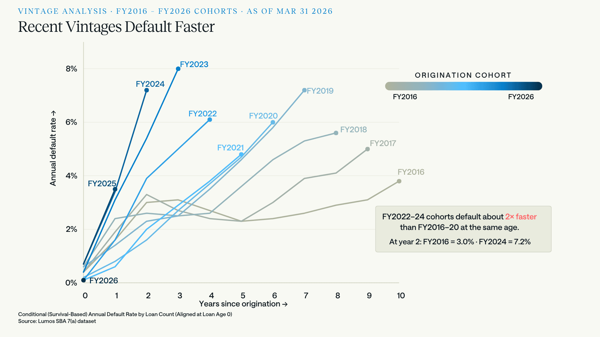
Conditional annual default rate, aligned at loan age zero. The FY2022–24 cohorts climb roughly twice as fast as FY2016–20 at the same age. At year 2, FY2016 sat at 3.0% while FY2024 sits at 7.2%.
The FY2022 and later cohorts are the first genuinely post-stimulus vintages. They got no fee waivers, no enhanced 90% guaranty, and no Section 1112 payments. They also originated straight into the Fed's hiking cycle, and because 7(a) is dominated by variable-rate structures tied to prime, existing borrowers repriced upward while new borrowers underwrote at rates their debt service coverage had never been tested against.
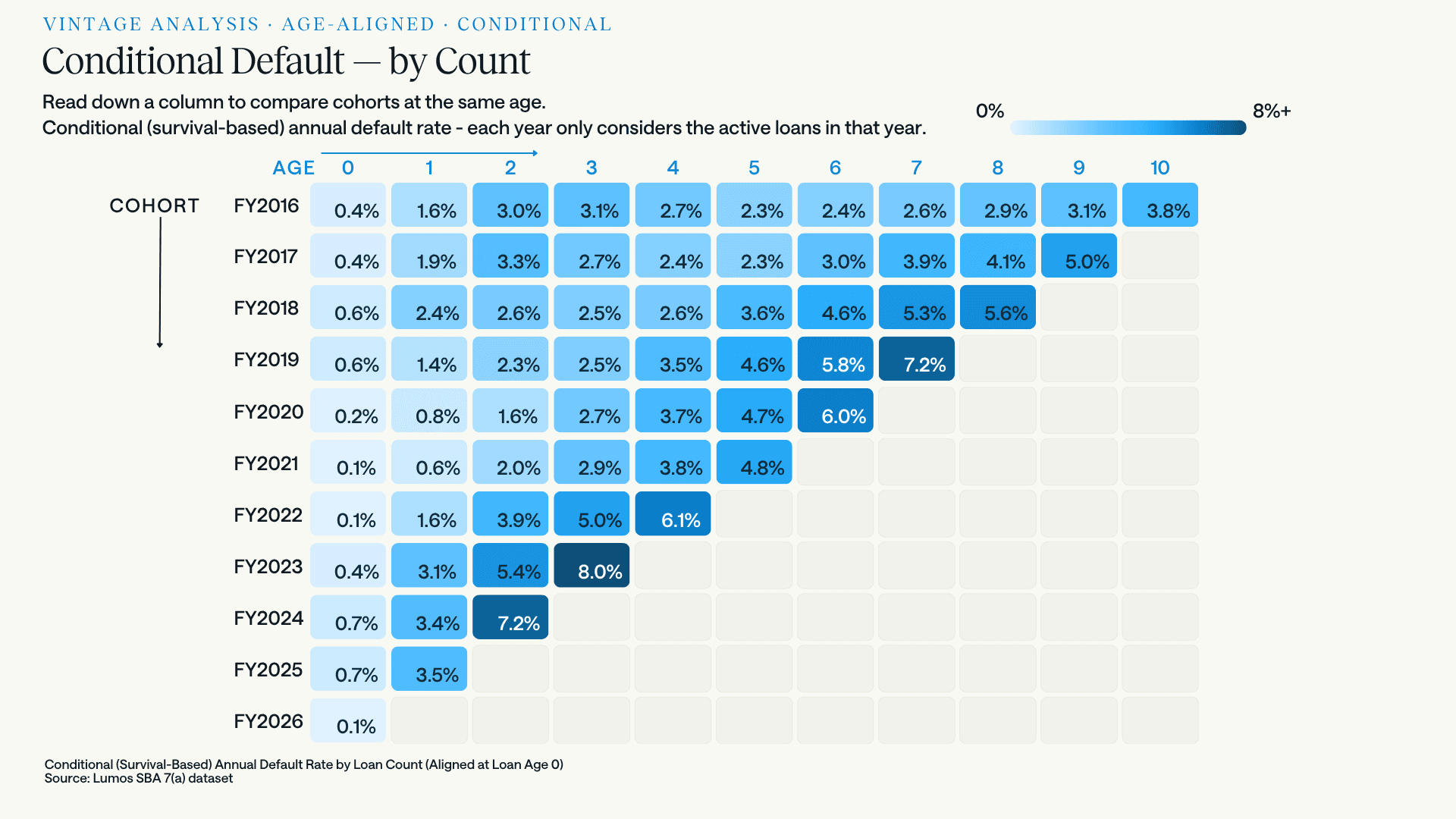
Read down a column to compare cohorts at the same age. At age 3, FY2016 sat at 3.1% and FY2023 sits at 8.0%. The deterioration is visible by age 1: FY2024 and FY2025 both entered year one at or above 3.4%, against 1.6% for FY2016.
The age-1 column is the part worth sitting with. FY2024 and FY2025 loans are defaulting at 3.4% and 3.5% in their first full year, more than double FY2016's 1.6% and roughly five times the FY2020–21 cohorts. Loans that default that early were generally mispriced or misjudged at origination rather than overtaken by events.
This is also where the scoring question gets sharp. Any small business credit score calibrated on pre-2020 borrower behavior encodes an assumption that year-one defaults run near 1.6%. Against a FY2024-shaped loan, that assumption underprices by a wide margin, and it does so silently, because a model that has not seen the new shape has no way to tell you it is looking at one. FY2025 has only two points on its curve so far, but both of them track FY2024 rather than FY2016. The cohort being written today will not produce a year-one number until 2027, which is the whole difficulty: on this measure the feedback arrives long after the decision.
INDUSTRY SECTOR · WHERE THE DISTRESS SITS
Not evenly distributed
The stress does not spread across the economy uniformly, which is why portfolio-average risk tolerance tends to mislead.
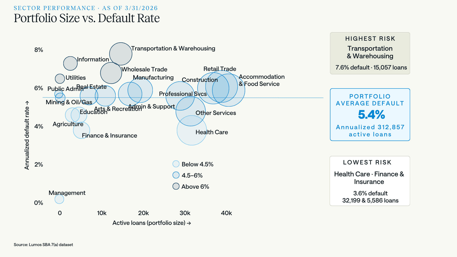
Annualized default rate by NAICS sector against portfolio size, first half of FY2026. Portfolio average is 5.4% across 312,857 active loans. Transportation & Warehousing is the clear outlier at 7.6% on 15,057 loans.
Transportation & Warehousing carries the highest default rate at 7.6%. The mechanics are not mysterious: freight rates normalized down from pandemic highs while fuel, equipment, insurance, and financing costs did not, and the sector is full of small operators who bought trucks at peak prices with variable-rate debt. Information, Utilities, Wholesale Trade, and Public Administration also run above 6%.
At the other end, Health Care and Finance & Insurance both sit at 3.6%, roughly 4 points below Transportation. Both are insulated from discretionary consumer spending, and Health Care carries 32,199 active loans. This is a large, low-risk book, not a rounding error.
A 4-point spread between the best and worst sectors is wider than most institutions' entire pricing grid. It is also knowable before a loan is booked, which is the argument for pulling sector and county-level risk factors into pre-qualification rather than discovering them in the servicing report.
Default and prepayment for all nineteen NAICS sectors, on a calendar basis against 2019, are set out in our industry benchmark.
There is a sharper version of that argument available now. The SBA's post-March-2026 underwriting rules require a documented 1.1:1 debt service coverage calculation on every 7(a) file, at any loan size. That floor is uniform. The risk it protects against is not. A 1.1:1 coverage ratio on a Transportation & Warehousing borrower and a 1.1:1 on a Health Care borrower are the same number describing populations that default at 7.6% and 3.6%. The regulator set a floor, not a credit policy. Nothing prevents a lender from requiring more coverage where the sector data says the borrower needs it, or from competing harder where it says they do not, and the sector data is not hard to come by.
LOAN SIZE · THE CURVE CHANGED SHAPE
Small loans are still the worst. Large loans are no longer safe.
Sector explains part of the spread. Size explains another part, and the way it explains it is not what it was ten years ago.
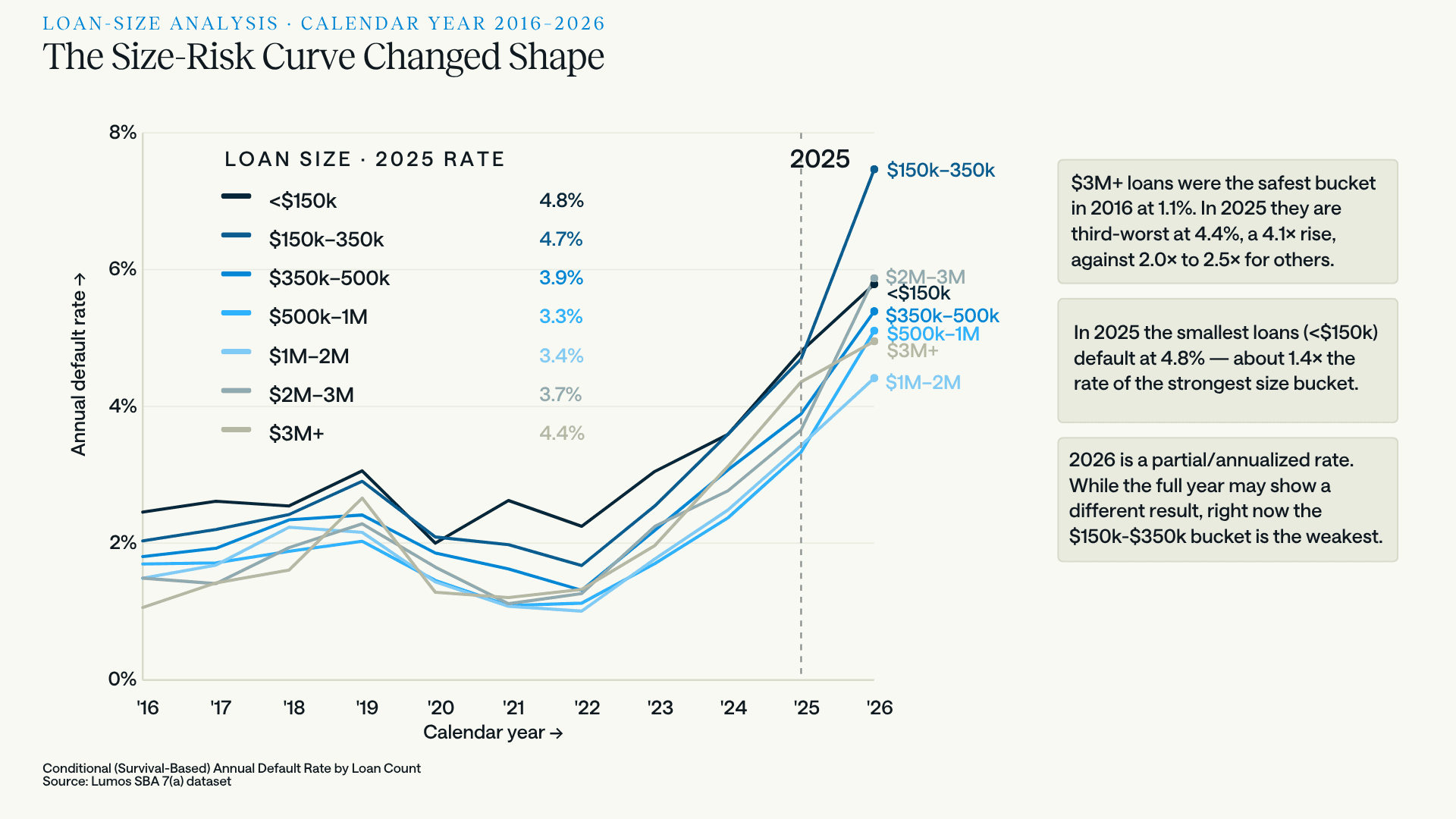
Conditional annual default rate by loan size, 2016 to 2026. Every bucket collapsed through the stimulus years and every bucket has climbed since 2022. But the shape of the relationship changed along the way.
In 2016 this chart was a ladder. Default rates fell almost perfectly in step with loan size: under $150K at 2.5% on top, $3M+ at 1.1% on the floor, everything else ranked in between. The logic was intuitive and the data obeyed it. Smaller loans go to smaller businesses: thinner capitalization, less runway, more owner-dependency, collateral covering less of the exposure.
The small end of that story is intact. Loans under $150K defaulted at 4.8% in 2025, the highest of any bucket and roughly 1.4x the best-performing band. Add the $150K–$350K bucket at 4.7% and the sub-$350K book remains the riskiest part of the portfolio.
The large end has broken. Here is 2025, ranked worst to best:
Loan size | 2025 default rate | vs. 2016 |
|---|---|---|
Under $150K | 4.8% | 2.0x |
$150K–$350K | 4.7% | 2.3x |
$3M+ | 4.4% | 4.1x |
$350K–$500K | 3.9% | 2.2x |
$2M–$3M | 3.7% | 2.5x |
$1M–$2M | 3.4% | 2.3x |
$500K–$1M | 3.3% | 2.0x |
The $3M+ bucket is now the third-riskiest in the portfolio, worse than everything between $350K and $3M. In 2016 it was the safest of all seven. That is 1.1% to 4.4%, a 4.1x multiple, when every other bucket on the chart moved between 2.0x and 2.5x.
One caveat on that multiple, because it is a real one. The 7(a) maximum loan size did not rise from $2 million to $5 million until the Small Business Jobs Act of 2010, so in 2016 the $3M+ bucket held nothing but post-2010 originations and had not yet developed a full age distribution. Some of the move from 1.1% to 4.4% is that bucket maturing rather than deteriorating.
It does not explain the size of it, though. The $2M–$3M bucket was almost entirely a post-2010 category too, subject to the same young-book effect, and it moved 2.5x against 4.1x for $3M+. Whatever is happening at the top of the size distribution is happening to the largest loans specifically, not to every category that grew up after 2010. And the 2025 cross-section, where every bucket has a real age mix behind it, shows the U regardless of how each bucket got there.
The mechanism is not mysterious once you consider what a $3M+ 7(a) loan almost always is. SBA eligibility rules constrain the category tightly: at that size the loans are overwhelmingly changes of ownership, partner buyouts and leveraged acquisitions, or substantial commercial real estate, and they are overwhelmingly floating against prime. Those deals carry heavy goodwill or fixed-asset weights and very little slack. Debt service on $4 million does not travel gracefully from 6% to 10.5%. A borrower with a $120K note felt the rate cycle. A borrower carrying $4M at prime plus a spread had their coverage ratio rewritten by it.
So the curve is now a U, and the safest place in the book is the middle of it. That is not where most risk appetite frameworks would have put it, and it is not what a policy built on "bigger loan, better credit" would predict.
THE $150K–$350K SIGNAL
One bucket is behaving differently from every other in the partial 2026 data, and it shows up on two independent measures.
On the conditional annual rate, $150K–$350K is annualizing at 7.5% in 2026, well clear of every other band and far above its own 4.7% in 2025. On early default, the same bucket sits at 3.3% by count, 1.6x the next-worst band and more than 3x its own 2019 level. One instrument measures the standing book; the other looks only at loans under 36 months old. Both point at the same place.
Two unrelated measures agreeing is harder to dismiss than either alone. But 2026 is a partial year annualized, and the full-year number may land elsewhere. It is worth flagging, not underwriting to.
It is worth noting what else changed in that neighborhood. The June 2025 SOP left the $150K–$350K band inside the streamlined track while pushing $350K–$500K out of it, a distinction the next section takes up. Most loans defaulting today were originated before that change, so this is not a causal claim. It is a reason to watch the band.
WHY THE SMALL-LOAN RETREAT IS NOT ONLY A RISK STORY
Our FY2026 volume analysis found approvals of $500K or less down about 38% by count, with the $350K to $500K band down 64%, the steepest fall of any size band. Set against the size-risk data above, the tempting read is that lenders looked at small-loan performance and pulled back.
The size data argues against it. If credit were driving the retreat, the worst-performing bands should have been cut hardest. They were not. The band that fell 64% carries a 3.9% default rate, fourth of seven and better than both bands beneath it. The under-$150K band, the worst performer in the portfolio at 4.8%, fell by considerably less. Lenders did not exit the riskiest loans. They exited one specific band, and that band is defined by a processing rule, not by credit.
There is an objection to that reading worth meeting head on. If processing cost is the mechanism, the largest originators should have retreated least, because they have the best economics for full underwriting: more analysts, more automation, better absorption of fixed costs. The opposite happened. The top 25 cut roughly 40% against 33.4% program-wide.
The likeliest explanation sharpens the processing argument rather than undercutting it. The largest small-dollar originators had built high-throughput, score-driven operations optimized for the streamlined track, which is how they became the largest originators in that band in the first place. What SOP 50 10 8 and the SBSS sunset did to them was not raise the cost per file so much as break a purpose-built channel. A lender writing twenty small loans a year through a manual process lost nothing, having never had the channel to lose. On that reading the retreat should concentrate exactly where it did, at the top, and it says nothing about the credit quality of the borrowers left behind.
One caution on treating the top 25 as a bloc. Within that group one originator is down more than 90% while several posted double-digit gains, so the aggregate describes a distribution rather than a decision.
One refinement is worth holding on to, because it changes what the 64% describes without changing what caused it. When the ceiling dropped to $350,000, a lender facing a $420,000 request had two options: run it through standard procedures with a full cash flow analysis, or write it at $350,000 and keep it streamlined. If enough chose the second, part of that decline is deals resized rather than deals declined.
The driver is identical either way. Shrinking a loan to sit inside a processing threshold is a response to processing cost, not to the borrower's baseline credit. What differs is the borrower's outcome: turned away in one version, underfunded in the other. And a borrower who needed $420,000 and took $350,000 carries thinner coverage than the file suggests. That would not be visible yet. The ceiling dropped in June 2025, so any resized loans are still too young to have defaulted, and if anything their presence flatters the 2026 reading rather than worsening it. It is a reason to watch the $150K to $350K band from here, not a reading of the partial-year spike flagged above.
The economics of small-dollar 7(a) moved three times in twelve months, all in the same direction.
Fees came back. The upfront guaranty fee waiver is worth pinning down, because its ceiling moved almost every year and each move defines a cohort. Under the Economic Aid Act the fee was waived entirely, at every loan size, from December 2020 through September 2021. FY2022 reverted to a $350,000 ceiling. FY2023 raised it to $500,000. Then, effective October 1, 2023 and announced that August, it went to $1 million or less. That window closed abruptly on March 26, 2025. From March 27, 2025 the fee applies across the program again: 2% of the guaranteed portion under $150,000, 3% from $150,000 to $700,000, and 3.5% of the guaranteed portion up to $1 million plus 3.75% above that. Lenders may pass the fee to the borrower and generally do.
Read that against the size distribution and the effect is specific. Loans over $1 million had been paying since 2021 and saw no change in March 2025. Everything below went from zero to two or three points of the guaranteed portion, typically financed into the note.
That fees steer origination is not a hypothesis. The SBA has demonstrated it deliberately: effective October 1, 2025 it waived the upfront fee entirely for qualifying small manufacturers in NAICS 31 through 33 on loans up to $950,000, precisely because a zero fee moves capital toward a policy priority. The same lever works in reverse.
The ceiling dropped. SOP 50 10 8, effective June 1, 2025, returned the 7(a) Small Loan ceiling from $500,000 to $350,000. Loans between $350K and $500K were pushed out of the Small Loan track into standard 7(a) procedures, which means they lost the streamlined treatment that had exempted them from full historical cash flow analysis. That is the band that fell 64%.
Note what that does to the attribution. The fee reinstatement hit every band below $1 million simultaneously, so the fee alone cannot explain why one band fell roughly twice as far as the rest. What distinguishes $350K to $500K is that it absorbed a second shock the others did not.
Then the exemption itself went away. As of March 1, 2026, the SBA sunset the FICO SBSS mandate on 7(a) Small Loans. That reads as deregulation, and for the score it is. But SBSS was never only a hurdle. Since 2014 it was the mechanism that let lenders skip an exhaustive historical cash flow analysis on loans of $350,000 or less: clear the score, skip the math. Removing the mandate removed the exemption with it. Loans above the ceiling always carried the full analysis; what changed is that the last carve-out for small-dollar loans is gone. A comprehensive commercial credit analysis, including a manual 1.1:1 debt service coverage calculation off the tax returns, is now required across the entire 7(a) program at any size.
It is worth remembering why 2014 happened in the first place. The SBA introduced the scoring exemption to solve a fixed-cost asymmetry: manually underwriting a small-dollar loan carried essentially the same compliance and administrative overhead as a very large one, and lenders responded rationally by not making the small ones. The exemption existed to unblock small-business liquidity. It has now been withdrawn, and the program sits roughly where it stood before 2014.
There is a case for the sunset that this analysis has not made, and it deserves airing. Loans of $350,000 and under are the two worst-performing buckets in the portfolio, at 4.8% and 4.7%, and they are precisely the loans the score-only prescreen covered. A regulator looking at that record could reasonably conclude that clearing a score was not doing enough work.
The vintage data complicates that reading rather than settling it. The exemption ran continuously from 2014, which means the FY2016 through FY2020 cohorts were underwritten under it too, and those are the cohorts performing acceptably. A constant cannot explain a change. Whatever moved between FY2020 and FY2024, it was not the availability of the prescreen.
None of which makes the sunset wrong. It may reflect fraud exposure, program integrity, fiscal pressure, or a judgment that the exemption's benefits stopped justifying its cost, and the SBA has not been subtle about tightening across the board since 2025. The point here is narrower: the removal has a predictable effect on small-dollar unit economics, and that effect is visible in the volume data whether or not the decision was correct.
Which makes the prediction fairly plain. The $350K to $500K band lost its exemption in June 2025 and volume fell 64%. Every band below $350,000 lost the same exemption in March 2026. If the mechanism is what it appears to be, FY2027 should show the rest of the small-loan book following the path the $350K to $500K band has already taken.
With one difference worth flagging. A $420,000 borrower could be written down to $350,000 to stay streamlined. A $300,000 borrower has nowhere lower to go, because below the ceiling there is no threshold left to duck under. Whatever share of the $350K to $500K decline was resizing rather than exit, that escape valve does not exist for the loans that lost their exemption in March.
None of that means credit performance is irrelevant. Both drivers are real and they point the same way. But the natural experiment sitting in the volume data suggests the processing rule is doing more of the work than the default rate is.
EARLY DEFAULT · A DIFFERENT INSTRUMENT
The conditional rates above tell you how a book is performing. Early default gives you an indication of how it was underwritten.
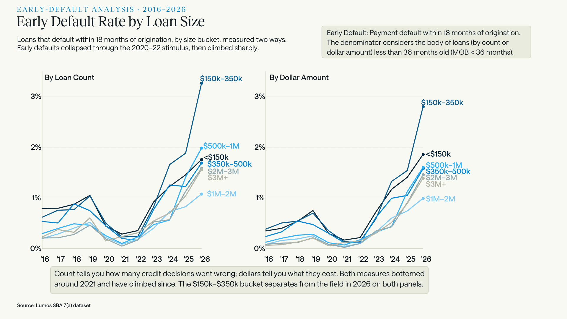
Early default by size bucket, measured two ways. Count tells you how many credit decisions went wrong; dollars tell you what they cost. Both measures bottomed around 2021 and have climbed since, and the $150K–$350K band separates from the field in 2026 on both panels.
Early default here is simple: a loan that defaults within 18 months of origination. The denominator is the pool of disbursed loans under 36 months on book: by loan count in the left panel, by approval amount in the right.
That 36-month denominator is a deliberate choice, and it is the part most people get wrong. If you define the young-loan pool as loans 18 months old or younger, you flood the denominator with two- and three-month-old loans that have not yet had the opportunity to fail. They add to the base without having passed through the risk window, and the resulting rate is artificially deflated for purely mechanical reasons. Widening the pool to 36 months means nearly every loan in it has already been through the full 18-month danger zone. The metric stabilizes and starts describing something real.
Why track it separately from the conditional rate: a loan that fails inside 18 months was rarely overtaken by events. Rates did not move that far, that fast, for that particular borrower. Early default is usually an origination artifact: optimistic projections, thin documentation, a debt-service coverage ratio that only worked on the spreadsheet, occasionally something worse. Mortgage lenders have tracked the equivalent metric, early payment default, for decades as the first flag for underwriting and fraud problems. The logic transfers directly.
It is also the fastest feedback loop available. A vintage curve takes years to fill in; by the time the FY2025 cohort's age-3 number exists, you will have booked three more cohorts on whatever assumptions produced it. Early default tells you something about the loans you wrote two quarters ago, while there is still time to act.
WHAT THE TWO MEASURES DISAGREE ABOUT
The useful part is not where early default confirms the annual rate. It is where they part company.
Rank the seven buckets on each measure for 2025 and two of them move sharply:
Loan size | Rank, annual default | Rank, early default |
|---|---|---|
$3M+ | 3rd worst | 6th of 7 |
$500K–$1M | 7th, the best | 3rd worst |
Large loans fail late, not early. The $3M+ bucket is third-worst on the standing book and sixth of seven on early default. Those loans are not blowing up in year one. They are grinding down over years three to five as rate resets work through coverage ratios, exactly what you would expect from leveraged acquisitions on floating structures. Early default was never going to catch them, and a lender watching only early-default dashboards would have missed the single fastest-deteriorating bucket in the portfolio.
The safest bucket is throwing the loudest early warning. $500K–$1M has the lowest annual default rate of any band at 3.3%. It also has the third-highest early default rate, and its early default has risen from 0.6% in 2024 to 1.4% in 2025 to 2.0% in 2026, which is 4.3x its 2019 level and the largest breakout of any bucket. The standing book looks pristine because it is full of seasoned loans that were underwritten under different conditions. The new originations are behaving very differently, and the annual rate will not show that for another two or three years.
That second finding has a candidate explanation sitting in the policy timeline, and it is worth stating carefully.
Recall the waiver trajectory. The ceiling sat at $350,000 in FY2022 and $500,000 in FY2023, then jumped to $1 million from October 1, 2023 until March 26, 2025. So loans below $500,000 were already waived and gained nothing from that jump. Loans above $1 million had been paying since the FY2021 blanket waiver lapsed. The marginal benefit landed on one band and one band only: $500K to $1M, which had been paying a scaled fee and abruptly stopped for eighteen months.
During that window a lender could size a deal toward $1 million without passing any fee to the borrower. Revenue scales with loan size; underwriting cost does not. The incentive to write the larger deal was unambiguous, and the friction that would normally argue against it was switched off.
Loans originated in that window are precisely what the 2025 and 2026 early-default figures are measuring. And the $500K–$1M band's early default jumped 2.5x between 2024 and 2025, the largest single-year move of any bucket on the chart. Every other band moved between 1.0x and 2.0x.
Loan size | Early default 2024 | 2025 | Change |
|---|---|---|---|
$500K–$1M | 0.56% | 1.41% | 2.5x |
$2M–$3M | 0.57% | 1.13% | 2.0x |
$3M+ | 0.70% | 1.04% | 1.5x |
Under $150K | 1.23% | 1.46% | 1.2x |
$150K–$350K | 1.66% | 1.88% | 1.1x |
$1M–$2M | 0.73% | 0.83% | 1.1x |
$350K–$500K | 1.26% | 1.23% | 1.0x |
This is a correlation with a plausible mechanism, not a demonstrated cause. Rates were rising across the same period, and the band contains plenty of loans that had nothing to do with the waiver. But it is a well-posed question rather than a vague worry, and it is answerable on a single institution's book in an afternoon: pull the $500K–$1M originations from October 2023 to March 2025, compare their early default against the same band on either side of the window, and check whether approved amounts drifted upward toward the ceiling. If deal sizes crept toward $1 million while credit quality held constant, the cohort is fine. If they crept up while coverage ratios thinned, that cohort is where your recent drift is concentrated, and it has not finished seasoning.
That is the entire case for carrying both metrics. One tells you where you are. The other tells you where you are going, and they do not always agree.
One asymmetry is worth carrying out of this. Count tells you how many credit decisions went wrong; dollars tell you what they cost. Dollar-based early default runs below count-based in six of the seven buckets, because within any band the loans that fail are the smaller ones. Your worst loans are your smallest, so a dollar-weighted view of portfolio quality will always understate how many borrowers you misjudged.
THE ARITHMETIC LEVER
Return to the prediction. If the mechanism really is processing cost, the sub-$350K book should follow $350K to $500K down through FY2027. That holds unless the cost of the file comes down, which is the one variable in this story the SBA did not legislate and the only one still sitting inside a lender's control.
None of this argues for abandoning small loans. It argues about arithmetic. Underwriting cost is largely fixed per file while revenue scales with loan size, which is the entire reason the 2014 exemption existed and the entire reason its withdrawal bites hardest at the bottom of the size distribution.
Be clear about what is not solvable. The cash flow analysis is mandatory now and no model removes it. A score does not calculate debt service coverage, and anyone implying otherwise is selling a compliance problem. The tax returns get worked either way.
What has changed is the alternative. The 2014 exemption was written when the practical substitute for an analyst and a spreadsheet was a single prescreen score, and the choice really was one or the other. Small business credit modeling has moved since: more loan-level performance history to train on, more of it spanning a full cycle, and methods that were conference papers in 2014 and are production infrastructure now. That does not make the analysis optional. It changes what the screen sitting in front of the analysis can do.
What a model can do is stop you spending those hours on files that were never going to fund. Every loan at $350,000 and under now carries the full analysis. Not every loan at $350,000 and under deserves one. A screen at the top of the funnel turns a fixed cost into a variable one, because the analyst's afternoon only gets spent on files that have already cleared a fast quantitative look. That is what the Lumos Business Report does at pre-qualification, and it is a more valuable step this year than it was last year.
Prime+ returns probability of default and expected loss in seconds through an API, scored on small business loan performance rather than consumer credit behavior, with the same inputs and weightings on every file. It also satisfies the one condition the SOP now places on model choice: since March 1, lenders may use their own model, subject to their primary federal regulator, provided it does not rely solely on consumer credit scores. That condition rules out the reflex of bolting a consumer score onto a commercial decision. What it leaves, and what makes a small business credit score worth using on a commercial file, we covered separately.
None of that reverses the fee reinstatement or the coverage test. It changes the loan size at which the arithmetic stops working, which is a different and more useful thing.
Worth noting what that implies competitively. The field is thinning for reasons that have little to do with the borrowers in front of you. When peers exit a segment because their unit costs stopped clearing, the lenders whose costs still clear inherit it.
LENDERS · THE $1B+ CLUB
Same program, same economy, wildly different results
If the 4.8% were purely macro, lender outcomes would cluster. They don't.
We looked at 36 anonymized lenders, each holding more than $1 billion in 7(a) loans as of March 31, 2026, and benchmarked 2025 default rates against CY2023, the first full year without the default-suppressing effects of stimulus and therefore a fair read on each lender's underlying risk floor.
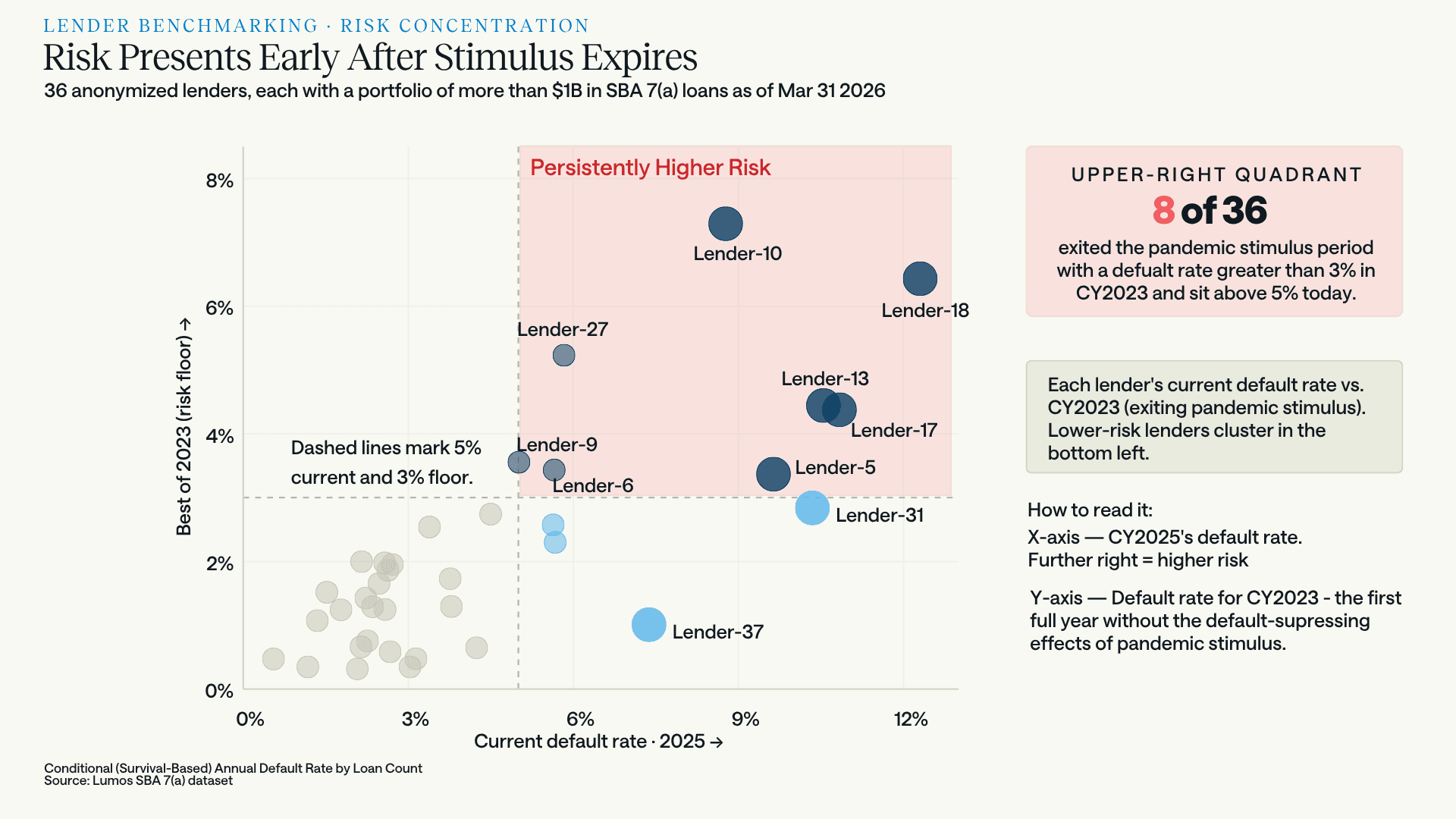
Current default rate against the 2023 risk floor. Eight of 36 sit in the upper-right quadrant: above 3% in CY2023 and above 5% today. These are not lenders the cycle caught out. They exited stimulus already running hot.
The quadrant matters because it separates two different problems. Eight lenders were carrying elevated risk before the macro environment turned, and are carrying more now. That is a persistent underwriting posture, not an event. But look at Lender-37, sitting at roughly 7.4% today against a 2023 floor near 1%. That is a fundamentally different failure: a book that was performing well and deteriorated fast. Same headline rate, opposite diagnosis, opposite remedy.
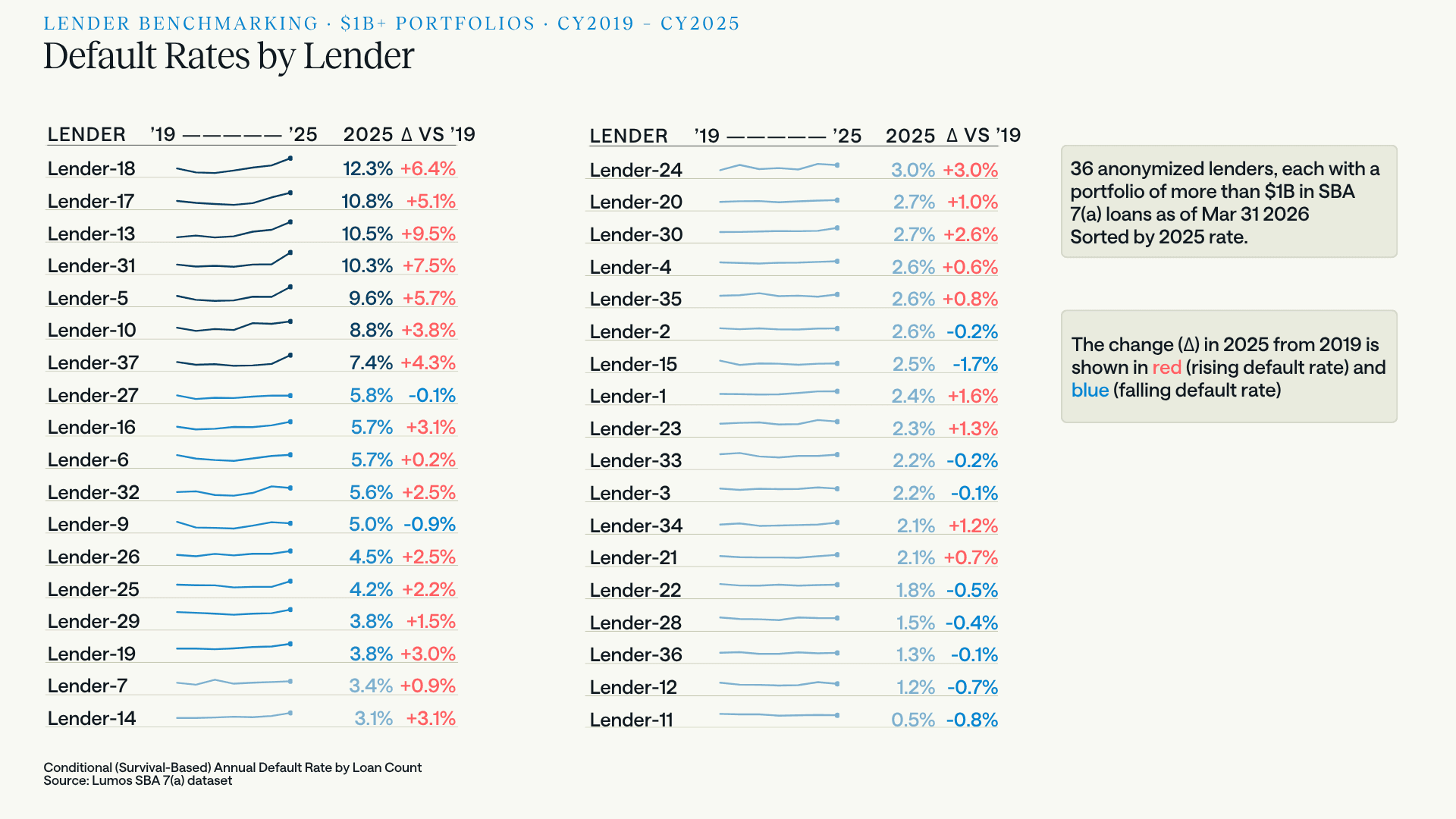
2025 default rates across 36 lenders with $1B+ portfolios, sorted high to low, with the change since 2019. The spread runs from 12.3% to 0.5%.
This is the chart that turns the macro explanation into an excuse. The highest default rate in the group is 12.3%. The lowest is 0.5%. That is a spread of more than 20x among lenders operating in the same program, under the same SOP, with the same guaranty, in the same economy, all at meaningful scale.
Put the two quantities side by side and the argument makes itself. The program average travelled 3.2 points across this entire cycle, from the 1.6% trough in 2021 to 4.8% in March 2026. Lender outcomes in 2025 alone span 11.8 points. The distance between the best and worst operator in a single year is close to four times everything the macro environment did to the program average over five.
And eleven of the 36 have lower default rates in 2025 than they did in 2019. Lender-15 is down 1.7 points. Lender-11, at 0.5%, is down 0.8. Roughly a third of this cohort is outperforming its own pre-pandemic baseline while the program average runs at a thirteen-year high.
The dispersion at the top is just as revealing. Lender-13 rose 9.5 points to 10.5%. Lender-31 rose 7.5 points to 10.3%. Lender-18 reached 12.3%. Meanwhile Lender-27, at 5.8%, is essentially flat against 2019. Adjacent default rates, entirely different trajectories.
Whatever is driving a lender to 12.3% while a peer holds 0.5%, it is not the interest rate environment. Both faced it.
THE TAKEAWAY
A segment problem, not a cycle problem
The honest read of 4.8% is narrower and more actionable than "credit is turning."
The macro data is not wrong; it is aimed elsewhere. Bank C&I delinquency and large-bank charge-offs describe borrowers the 7(a) program largely doesn't serve. When you look at instruments pointed at small firms specifically (Subchapter V filings, the SBCS, the SLOOS question that separates small firms from everyone else) the 7(a) signal is corroborated. The stress is real, and it is concentrated in a segment the headline indicators average away.
Within that segment, the risk is concentrated again: in the FY2022–24 vintages, in a handful of sectors, at both ends of the size distribution, and, most of all, in specific lenders. An 11-of-36 group is beating its 2019 performance in this environment. That is the finding that should reframe the conversation, because it means the current default rate is substantially a function of choices, not conditions.
Some of what the data shows is genuinely counterintuitive, which is the argument for looking rather than assuming. The size-risk curve is no longer the ladder it was in 2016; the largest loans have deteriorated fastest and now sit third-worst, while the safest band is the unglamorous middle. A risk policy inherited from the last decade encodes the old shape.
The early default curve is the clearest evidence for that. Loans failing inside 18 months were not undone by the rate environment; they were underwritten into it. That number has climbed in essentially every year since 2021, on both measures, and it is the one metric here that reports back fast enough to change what you do next quarter.
Two things follow for anyone underwriting into FY2027. First, a model calibrated on pre-2020 behavior is calibrated on a borrower population that no longer exists; the year-one default rate has more than doubled since FY2016, and a score that hasn't reacted to that is quietly mispricing every new file. Purpose-built small business models like Prime+ exist for this reason: built on small business loan performance across full cycles rather than consumer credit behavior, and calibrated to move with conditions. Second, portfolio-level averages are actively hiding the answer. The 4.8% tells you nothing you can act on. The vintage curve, the sector spread, and your own position in that lender scatter do.
The lenders at 0.5% are not luckier. They are reading a different set of numbers.
About this analysis
Visualizations and analyses in this report were built from SBA 7(a) loan-level data in the Lumos Data Portal, which holds more than 2 million SBA loans and 30 years of performance history. Subscribers can run these cuts themselves by lender, industry, geography, loan size, or vintage.
The same analytics can be pointed at a single institution's book rather than the whole market. Lumos Portfolio Insights applies them to small business portfolios, SBA and non-SBA, with probability of default, loss given default, and expected loss at the loan level, plus risk migration tracking and segmentation by vintage, industry, and geography. These are the same views used to build the charts above.
FAQ: SBA credit performance, answered
What is the current SBA 7(a) default rate?
As of March 31, 2026, the trailing twelve-month default rate on the full 7(a) portfolio was 4.8%. That is the highest reading since 2013 and roughly three times the 1.6% trough recorded in 2021, but still well below the 11.6% peak reached in 2010.
Why are SBA 7(a) default rates rising in 2026?
Three factors compound. Pandemic programs (PPP, EIDL, and Section 1112 debt relief) artificially suppressed defaults through 2022, so the baseline being compared against was never a real credit outcome. Loans originated from FY2022 onward received none of that support and originated into a high-rate environment, and 7(a) is heavily variable-rate. And credit outcomes vary enormously by lender, suggesting underwriting decisions are a major driver alongside conditions.
Is small business credit risk increasing across the whole market, or just SBA loans?
Its default rate should always sit above bank C&I delinquency; comparing the levels is meaningless. What matters is where each population sits against its own history, and both need the same correction, because the pandemic floor was artificial in the bank data too. Both series normalized off a suppressed 2021 trough. Small-bank delinquency stopped well inside its historical range. The 7(a) portfolio went past its own. Indicators aimed at small firms agree with the SBA signal: Subchapter V filings rose 50% year over year in the first half of 2026, and the Fed's January 2026 SLOOS found banks expecting loan quality to deteriorate for small-firm C&I loans specifically, while holding steady for larger firms.
Which SBA loan vintages are performing worst?
FY2022 through FY2024. These cohorts default roughly twice as fast as FY2016–20 at the same loan age. At year 2, the FY2016 cohort sat at 3.0% versus 7.2% for FY2024. At year 3, FY2016 sat at 3.1% versus 8.0% for FY2023. The deterioration is visible by year 1, where FY2024 and FY2025 both sit at or above 3.4% against 1.6% for FY2016.
Related: a companion analysis of SBA 7(a) prepayment speeds confirms these same vintages prepaid the least, which rules out survivorship and shows the default rise is genuine credit deterioration.
Which industries have the highest SBA default rates?
For the first half of FY2026, Transportation & Warehousing is highest at a 7.6% annualized default rate across 15,057 active loans, pressured by normalized freight rates against elevated fuel, equipment, and financing costs. Information, Utilities, Wholesale Trade, and Public Administration also run above 6%. Health Care and Finance & Insurance are lowest at 3.6%. The portfolio average is 5.4% across 312,857 active loans.
Sector-by-sector figures on a calendar-year basis are in our industry benchmark.
Do smaller SBA loans default more often than larger ones?
At the small end, yes, but the relationship is no longer a straight line. In 2025, loans under $150,000 defaulted at 4.8%, the highest of any bucket, and $150,000 to $350,000 followed at 4.7%. But the curve turns back up at the top: $3M+ loans defaulted at 4.4%, third-highest, ahead of every band between $350,000 and $3M. The safest bucket is the middle. This is a change: in 2016 the ordering was cleanly monotonic, smallest defaulting most and $3M+ least at roughly 1%. Large loans have deteriorated fastest in relative terms since, plausibly because $3M+ credits are typically leveraged acquisitions or commercial real estate structured floating against prime, where the rate cycle hit debt service hardest.
Which SBA loan size bucket is deteriorating fastest right now?
On partial 2026 data, $150,000–$350,000 separates sharply from every other band on two independent measures: it annualizes at 7.5% on the conditional default rate, against 4.7% in 2025, and sits above 3% by count on early default, roughly 1.6x the next-worst band. Because two unrelated measures agree, the signal is harder to dismiss as noise, but 2026 is a partial year annualized and the full-year figure may differ.
What is an early default rate, and why measure it?
Early default measures loans that default within 18 months of origination. It matters because a loan failing that quickly was rarely overtaken by macroeconomic events; it usually reflects an origination problem such as optimistic projections, thin documentation, or a debt-service coverage ratio that only worked on paper. It is the small business analog of early payment default in mortgage lending, and it is the fastest feedback loop a lender has on underwriting quality, since vintage curves take years to fill in. SBA 7(a) early default troughed in 2021 and has climbed in essentially every year since, on both a count and a dollar basis. It should be paired with the annual default rate rather than read alone: the largest loans fail late rather than early, so early default understates them.
Why does the early default rate use a 36-month denominator for an 18-month window?
To avoid deflating the metric artificially. If the young-loan pool were limited to loans 18 months old or younger, it would include loans only two or three months old that have not yet had the opportunity to default. Those loans inflate the denominator without having been exposed to the full risk window, pushing the rate down for mechanical reasons. Extending the pool to loans under 36 months on book means nearly every loan in it has seasoned completely through the 18-month danger zone, producing a more accurate and stable measure of early default risk.
What is a conditional default rate, and how does it relate to cumulative loss?
A conditional or survival-based default rate has a denominator that considers the loans still active at the start of each period rather than the original cohort, so it measures the risk of the surviving portfolio independent of how quickly good loans pay off. That matters in SBA 7(a) because loans exit early and often through business sales and refinancing, and the ones that leave voluntarily are disproportionately the healthy ones, leaving a pool riskier than the one originally booked. The unconditional or cumulative view divides by the original cohort and answers a different question: total loss across a pool's life. The two are not rivals. Lifetime loss estimates are typically built from conditional rates, by estimating period-by-period conditional probabilities of default, survival-weighting each period, and chaining the result into a cumulative figure. The conditional curve is the input; cumulative loss is the output. CECL reserving lives at the output end; forecasting and portfolio management live at the input end.
Why did SBA small-loan volume fall so sharply in FY2026?
The evidence points more toward processing economics than credit. Approvals of $500,000 or less fell about 38% by count in FY2026, and the $350,000 to $500,000 band fell 64%, the steepest of any size band. But that band is not the riskiest: its 3.9% default rate is fourth of seven, better than both bands beneath it, while the worst performer under $150,000 fell considerably less. Two shocks landed. The upfront guaranty fee returned in March 2025 across every band below $1 million, which cannot explain why one band fell twice as far as the rest. What distinguishes $350,000 to $500,000 is a second shock the others did not absorb: SOP 50 10 8 returned the Small Loan ceiling to $350,000 in June 2025, pushing that band into standard procedures requiring full historical cash flow analysis.
Does a small business credit score built on consumer credit data still work for SBA lending?
The vintage data argues against relying on one alone, and as of March 2026 the SBA agrees. Borrower behavior moved: year-one default rates rose from 1.6% for the FY2016 cohort to 3.4% for FY2024, and FY2022 through FY2024 cohorts default roughly twice as fast as FY2016 through FY2020 at the same loan age. Any model calibrated on pre-2020 performance encodes the old shape and will underprice a current file without signalling that it is doing so. The regulator moved too: when the SBA sunset the FICO SBSS prescreen mandate on March 1, 2026, it permitted lenders to use their own model, subject to their primary federal regulator, on the explicit condition that it not rely solely on consumer credit scores. The implication is that a small business scoring model should be trained on small business loan performance across full cycles and recalibrated as conditions move.
What did the SBSS sunset actually change for lenders?
More than it appears. Since 2014, a passing FICO SBSS prescreen let lenders skip an exhaustive historical cash flow analysis on 7(a) Small Loans: clear the score, skip the math. The SBA created that exemption to solve a fixed-cost asymmetry, since underwriting a small loan cost roughly what underwriting a very large one cost and lenders had responded by avoiding small loans. When the mandate sunset on March 1, 2026, the exemption went with it. Loans above the Small Loan ceiling always carried the full analysis; what changed is that the last carve-out for small-dollar loans disappeared, leaving a comprehensive commercial credit analysis and a manual 1.1:1 debt service coverage calculation required across the entire program. Lenders may now choose their own scoring model, subject to their primary federal regulator, provided it does not rely solely on consumer credit scores.
Did the SBA fee waiver affect loan credit quality?
There is a correlation worth investigating, though not a demonstrated cause. The upfront guaranty fee waiver ceiling moved repeatedly: $350,000 in FY2022, $500,000 in FY2023, then $1 million from October 1, 2023 until the waiver was sunset on March 26, 2025. Bands below $500,000 were already covered and gained nothing from the increase; bands above $1 million had not been covered since the FY2021 blanket waiver lapsed. The $500,000 to $1 million band is therefore the only one for which that change was a new benefit, and during those eighteen months a lender could size a deal toward $1 million without passing any fee to the borrower. Loans originated in that window are what the 2025 and 2026 early default figures measure, and that band's early default jumped 2.5x between 2024 and 2025, the largest single-year move of any size band against 1.0x to 2.0x elsewhere. Rising rates over the same period are an obvious complicating factor.
Is small-dollar SBA lending still viable after the SBSS sunset?
That depends on what a file costs to underwrite, and the cost moved twice in twelve months. The upfront guaranty fee returned in March 2025 on loans of $1 million or less, which had previously paid nothing. Then the March 2026 SBSS sunset removed the exemption that since 2014 had let lenders skip full historical cash flow analysis on loans of $350,000 and under. Both land on small files, and underwriting cost is largely fixed per loan while revenue scales with loan size. The behavioral evidence is already visible: the $350,000 to $500,000 band lost its exemption in June 2025 and approval volume fell 64%, the steepest of any size band, even though its 3.9% default rate is only fourth-worst of seven. Lenders exited on economics, not credit. What remains is a triage problem rather than a compliance problem. The cash flow analysis is mandatory and no model removes it, since a score does not calculate debt service coverage. But not every application deserves an analyst's afternoon, and screening at the top of the funnel converts a fixed cost per file into a variable one. The Lumos Business Report is built for that pass: a qualification grade with sector and geographic risk context, returned before an analyst opens the file.
How much do SBA lender default rates vary?
Enormously. Across 36 anonymized lenders each holding more than $1 billion in 7(a) loans, 2025 default rates range from 0.5% to 12.3%, a spread of more than 20x within the same program and economy. Eight of the 36 have been persistently elevated since 2023. Eleven are running below their own 2019 default rate.
Are any SBA lenders improving despite the rising default environment?
Yes. Eleven of the 36 largest 7(a) lenders posted lower default rates in 2025 than in 2019. That roughly one-third of the cohort is outperforming its pre-pandemic baseline while the program average sits at a thirteen-year high is the strongest evidence that current outcomes reflect underwriting and portfolio management choices as much as macro conditions.
Notes & Sources
Measurement. Federal Reserve figures are seasonally adjusted throughout. Except where noted, default rates are conditional (survival-based) annual default rates by loan count, meaning each year's denominator considers the loans still active in that year. This isolates the credit risk of the surviving portfolio independent of how quickly healthy loans pay off. Unconditional and cumulative measures divide by the original cohort and answer a different question, namely total loss across a pool's life, which is what pricing a new loan needs and what CECL reserving must ultimately report. The two are complements rather than alternatives: lifetime loss estimates are generally constructed from conditional probabilities of default, survival-weighted and chained into a cumulative figure. This analysis sits at the conditional end of that pipeline and does not present cumulative loss estimates. The FY2016 exhibit in the methodology section is the one place both measures appear: the unconditional (origination-based) series there divides by the origination-year loan count, while the conditional series divides by the loans active in each year. Vintage curves are aligned at loan age zero.
Reconciling the headline figures. Three different measures appear in this piece and are not directly comparable. The 4.8% headline is a twelve-month rolling rate on the full 7(a) portfolio as of March 31, 2026. The 5.4% portfolio average in the sector analysis is annualized on the first half of FY2026. The loan-size series is a conditional annual rate by calendar year. Calendar-year 2026 figures are partial and annualized, and may not hold as the year completes. Each construction is defined and reconciled in our guide to how Lumos measures default and prepayment.
Early default rate. Defined as a loan that defaults within 18 months of origination. Shown two ways. By count: the numerator is the count of young loans (MOB < 36) meeting that condition, and the denominator is the loan count for disbursed young loans (MOB < 36). By dollars: the numerator is the dollar amount defaulted, and the denominator is the approval amount for disbursed young loans (MOB < 36). The 36-month denominator boundary is intentional. Restricting the pool to loans 18 months old or younger would populate the denominator with loans too new to have passed through the 18-month risk window, inflating the base and deflating the rate for mechanical rather than credit reasons. A 36-month pool has largely seasoned through that window, producing a more stable and accurate measure.
On count versus dollars. In 2026, dollar-based early default runs below count-based in six of the seven size buckets, which indicates that within a given band the loans failing are the smaller ones. The exception is the under-$150K bucket, where the dollar rate (1.9%) sits above the count rate (1.8%), indicating that inside the smallest band it is the $100K to $150K loans failing rather than the $25K ones.
Lender benchmarking. 36 anonymized lenders, each with more than $1 billion in SBA 7(a) loans as of March 31, 2026. CY2023 is used as the risk-floor benchmark because it is the first full calendar year largely free of the default-suppressing effects of pandemic stimulus.
Policy context. Section 1112 of the CARES Act had the SBA make principal and interest payments directly on eligible 7(a) loans. PPP and EIDL supplied additional liquidity. Enhanced guaranty levels and fee waivers applied to certain 2020–2021 originations. Loans originated FY2022 and later received none of these supports.
Guaranty fees. The upfront guaranty fee waiver ceiling moved repeatedly:
Era | Active window | Upfront fee waiver ceiling | Authority |
|---|---|---|---|
FY2021 (pandemic stimulus) | Dec 27, 2020 – Sep 30, 2021 | 100% waived, all loan sizes | Economic Aid Act / Notice 5000-20084 |
FY2022 (post-stimulus reversion) | Oct 1, 2021 – Sep 30, 2022 | $350,000 or less | Baseline reversion |
FY2023 | Oct 1, 2022 – Sep 30, 2023 | $500,000 or less | Information Notice 5000-836123 |
FY2024 – mid-FY2025 | Oct 1, 2023 – Mar 26, 2025 | $1,000,000 or less | Information Notice 5000-848801 |
Post-clawback | Mar 27, 2025 – present | Waiver sunset; fees reinstated at all sizes |
Reinstated schedule from March 27, 2025: 2% of the guaranteed portion under $150,000; 3% from $150,000 to $700,000; 3.5% of the guaranteed portion up to $1 million plus 3.75% above that from $700,001 to $5,000,000. Short-term loans with maturities under one year carry a flat 0.25%. Effective October 1, 2025 through September 30, 2026, the SBA waived the upfront fee for qualifying small manufacturers in NAICS sectors 31–33 on loans up to $950,000.
On the fee-free window and the $500K–$1M cohort. The October 2023 ceiling increase conferred a new benefit on the $500,001 to $1 million band alone: bands below $500,000 were already covered, and bands above $1 million had not been covered since the FY2021 blanket waiver lapsed. Originations from that window fall inside the pools measured by the 2025 and 2026 early default rates. The association noted in the text is a correlation with a plausible mechanism and is not presented as a demonstrated cause; rising rates over the same period are an obvious confound.
On loan size categories. The 7(a) maximum loan size rose from $2 million to $5 million under the Small Business Jobs Act of 2010. The $2M–$3M and $3M+ buckets are therefore almost entirely post-2010 categories, and their earliest observations reflect young books without a full age distribution. This is noted in the text where it bears on the 2016 to 2025 comparison.
On the cash flow exemption. Historical cash flow underwriting from business tax returns, including EBITDA reconstruction, add-backs, and a debt service coverage calculation, has been standard on 7(a) loans above the Small Loan ceiling for decades. From 2014, loans at or below that ceiling were effectively exempt: a passing FICO SBSS prescreen let lenders bypass the full historical cash flow analysis. SOP 50 10 7 raised the ceiling to $500,000 in August 2023; SOP 50 10 8 returned it to $350,000 effective June 1, 2025. The SBSS mandate was then sunset effective March 1, 2026 under SBA Procedural Notices 5000-875701 and 5000-876777, replaced by a documented commercial credit analysis and a minimum 1.1:1 debt service coverage ratio. The practical effect is a return to the pre-2014 regime, in which the cash flow burden applies uniformly at every loan size.
External data. Federal Reserve, Charge-Off and Delinquency Rates on Loans and Leases at Commercial Banks, Q1 2026 (DRBLACBS, DRBLOBS). Federal Reserve Senior Loan Officer Opinion Survey, January 2026 and April 2026. Federal Reserve Banks, 2026 Report on Employer Firms: Findings from the 2025 Small Business Credit Survey. Epiq AACER / American Bankruptcy Institute, small business bankruptcy filings, first half 2026, July 8, 2026. JPMorgan Chase and Wells Fargo second quarter 2026 earnings releases, July 14, 2026.
Data. SBA 7(a) loan-level data from the Lumos Data Portal. Analysis and charts by Lumos.
Book a 30-minute demo. No pressure, no sales pitch. Just a straightforward conversation about whether Lumos is right for you.
What To Expect:
Quick platform overview
Live demo with real loan examples
Discussion of your specific needs
Clear next steps
"The data and insights provided by Lumos have been instrumental in driving numerous policy changes within our organization."
VP, Senior Product Manager, US Bank

" height="29.26525980811059px" id="Eth71R0cp" transform="translate(50.52 7.877)" width="128.4356838868068px"/><path d="M 11.504 26.662 C 13.336 26.98 15.177 27.241 17.025 27.445 C 17.285 29.224 17.589 31.249 17.922 33.01 C 19.147 32.283 21.153 30.675 22.427 29.793 C 23.831 30.749 25.613 32.22 26.99 33.03 C 25.815 36.077 24.734 39.17 23.558 42.217 C 23.29 42.912 22.993 43.872 22.596 44.483 C 21.955 44.554 21.761 43.465 21.609 42.971 C 20.391 40.097 18.964 36.046 17.872 33.065 C 16.793 33.66 7.128 38.055 6.752 38.016 C 6.687 38.009 6.584 37.851 6.538 37.796 C 6.428 37.314 9.351 31.438 9.748 30.419 C 10.07 29.592 11.059 27.547 11.504 26.662 Z M 33.315 17.665 C 33.811 17.67 44.337 21.602 44.765 21.893 C 44.829 22.154 44.823 22.057 44.743 22.33 C 44.2 22.746 41.332 23.727 40.478 24.044 L 33.378 26.673 C 33.931 27.703 34.585 29.232 35.077 30.314 L 37.921 36.591 C 38.139 36.993 38.577 37.669 38.215 38.059 C 37.576 38.025 28.285 33.71 27.005 33.081 C 27.245 31.226 27.527 29.375 27.852 27.532 C 29.68 27.191 31.452 27.024 33.361 26.642 C 32.387 25.285 31.08 23.402 30.028 22.145 C 31.145 20.668 32.241 19.174 33.315 17.665 Z M 11.47 17.635 C 12.542 19.071 13.786 20.686 14.782 22.158 C 13.751 23.535 12.423 25.259 11.471 26.662 C 7.932 25.41 3.445 23.785 0 22.375 L 0 21.889 C 0.606 21.563 4.34 20.21 5.18 19.923 C 6.787 19.373 10.005 17.985 11.47 17.635 Z M 38.174 6.263 C 38.651 6.647 36.872 9.988 36.559 10.642 C 35.557 12.85 34.425 15.506 33.354 17.637 C 31.433 17.286 29.758 17.057 27.819 16.83 C 27.504 14.962 27.219 13.088 26.965 11.21 C 28.001 10.653 37.733 6.247 38.174 6.263 Z M 11.501 17.628 C 11.491 17.63 11.481 17.633 11.47 17.635 C 11.467 17.63 11.463 17.625 11.459 17.62 C 11.47 17.617 11.482 17.615 11.493 17.613 C 11.496 17.618 11.498 17.623 11.501 17.628 Z M 6.584 6.275 C 7.178 6.118 16.533 10.566 17.901 11.193 C 17.626 12.874 17.196 15.105 17.02 16.753 C 15.137 17.022 13.363 17.27 11.493 17.613 C 10.01 14.74 8.822 11.568 7.374 8.666 C 7.162 8.243 6.391 6.664 6.584 6.275 Z M 25.57 7.432 C 25.913 8.348 26.716 10.341 26.965 11.21 C 26.335 11.545 23.197 13.924 22.45 14.47 C 20.941 13.448 19.381 12.27 17.901 11.193 C 18.006 10.669 18.713 8.998 18.925 8.369 C 19.829 5.694 21.248 2.668 22.023 0 L 22.788 0 Z" fill="rgb(28, 26, 26)" height="44.486082377664px" id="u84SiQ2Nx" transform="translate(0 0.255)" width="44.80873390361835px"/></svg>)